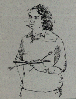
It's A Go Picture!!!! Thanks to the expert negotiating skills of my lovely agent wife, and maybe also because I've been working hard on all these paintings lately, I'm going to be doing a solo show at the Los Angeles River Lil' Frogtown Gallery from August 31st to September 20th with the opening reception on Saturday, August 31 from 6-9pm! I'm really excited and nervous in a good way. I've got a lot of work to do, but it's a small space so I won't be showing all the new pictures. This is good because I'll be able to concentrate in the next few weeks on just those pictures which will be in the show. Unfortunately it means that some of the paintings won't be in the show, but hey, I have to leave some to sell on ebay, right? We'll be sending out full-color postcards next week, so if you'd like one, send your snail mail address to sendmeapostcard(at)mcilvanity.com or enter it using the comments section of this handy form. I hereby promise not to share your info etc. etc. To the right is the postcard for my graduating show at the College of Creative Studies at UCSB. It's a drawing of me with a pallette done by the awesome Debbie Urlik. I had her do it because I knew she could make me look like a Serious Artist. So now one of the things I have to do is come up with a name for the show in the next few days. I could use something generic like "Gregory John McIlvaine: New Work" or "Gregory John McIlvaine: Recent Paintings," but that's not my style. Instead, Here are some other possibilities: Gregory John McIlvaine: Friends, Romantics, and Country Music Gregory John McIlvaine: Cheers - Makin' Your Way in the World Today Gregory John McIlvaine: Portrait of Tony Pierce and other Paintings Gregory John McIlvaine: A Sense of Life Gregory John McIlvaine: The Pursuit of Happiness Gregory John McIlvaine: Post Deconstructionist Dialogues Gregory John McIlvaine: Art Show Yay!!! Gregory John McIlvaine: Secret Passages Gregory John McIlvaine: Loving Life and Fighting Strife Gregory John McIlvaine: My Paintbrush is my Swagger Stick Gregory John McIlvaine: Continental California Sci-Fi Metropolis Gregory John McIlvaine: Atsa Lotsa Meatball Gregory John McIlvaine: These Colors Don't Run Gregory John McIlvaine: Kill the Monster Gregory John McIlvaine: Don't Blame Me, I Voted for Ken Layne Gregory John McIlvaine: We the Living Gregory John McIlvaine: Immortal Beloved Gregory John McIlvaine: Living After Midnight, Rocking to the Core Gregory John McIlvaine: To Serve Man Gregory John McIlvaine: Chubby Rain Gregory John McIlvaine: Not a Good Speller Gregory John McIlvaine: Kicking Ass and Making Up Names Gregory John McIlvaine: Thanks A Lot
Send your comments or suggestions to heresagoodnameforyourshowgreg(at)mcilvanity.com.
posted by Greg 12:44 PM
Monday, July 29, 2002
Immortal Beloved (1994) - Bad - I had high hopes for this movie about Beethoven. In the end I found it very frustrating and unsatisfying in many ways. The biggest problem was that the character of Beethoven is only shown later in life when he's deaf and mean and crazy, so you don't have any sympathy for him. His softer side is only shown at the very end, but by then you don't care about him, and the motivation for his only good act is never made clear. The structure of the film was confusing, and you never quite knew if you were in a flashback or not. In Amadeus, the obvious comparison, we see Mozart's flaws but also his genius and delight in creativity. Beethoven is portrayed as just a bitter jerk. And it's especially sad because the art direction and period setting are very well done, and Gary Oldman does an excellent job as usual as Beethoven. And the music is real good. This is similar to my criticism of Pollock, which ignored the joy and energy that made him paint in order to focus exclusively on his bad behavior, which made me not like or respect him. Perhaps I wouldn't have liked him in real life, but I think I would have respected him. I guess these movies were going for a kind of realism, but it seems kind of sad and pointless to me to spend all this energy creating a piece of art which only serves to knock another artist down a notch. These movies want to "humanize" their subjects, but I think that this can be done while still acknowledging that spark which drives them and separates them from those who don't create. I believe in a certain amount of idealization in art. Another example (besides Amadeus) of a movie about an artist who is flawed but who you have sympathy for is Lust for Life starring Kirk Douglas as Vinnie Van Gogh. Here's a painting I did years ago over a picture from that movie:
Austin Powers in Goldmember (2002) - Good Good Good Good - I'm a big fan of the Austin Powers series, and this installment did not dissappoint. We attended the very first showing at the Los Feliz 3 with an excited and receptive audience, ready to laugh. It's hard for me to be objective on this one because I've looked forward to it for so long, but I can say that I had a smile on my face throughout and even now feel a strong urge to see it again. Mini-Me clearly deserves a Best Supporting Actor award for his tour-de-france performance. Highlight the text bellow to find out why I didn't give it five Goods. I've hidden it because it is a little bit of a spoiler: Too many scientologists in the picture!
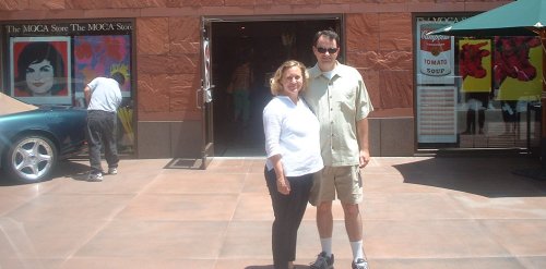
Bellow is a picture of M and K in front of the painting "Downtown" by Frank Romero at the Double Vision Arts Gallery on Wilshire, accross the street from the Tar Pits. We attended the opening reception last night and had a great time deciding which of the colorful pictures of cars and palm trees we liked the most. Then we spent two hours debating their merits over comida mexicana de Baja Fresh.
posted by Greg 1:40 PM
Reign of Fire (2002) - Good - How can you go wrong with a high-budget film about Dragons who come back to life and destroy most of the earth, leaving only small bands of people to fight them for the survival of humanity? Well, watch this movie and learn. It's sunk by a script that makes no sense, even to an audience willing to suspend disbelief. The movie makers seem to have forgotten that there might be something funny about their concept, and the lack of any humor whatsoever eventually becomes grating. The reason I give this movie one Good is that the art-direction, special effects, and action sequences are all very good. Even the acting is fine, and I particularly enjoyed Matthew McConaughey as the over-the-top American dragonslayer. He seemed to be the only one who realized that this movie should be at least a little bit funny.
Cool Runnings (1993) - Good Good Good Good - A sweet formulaic Disney movie in which each character overcomes their own individual obstacles and learns a valuable lesson in the end. Doug E. Doug delivers a particularly strong performance as Sanka Coffie.
posted by Greg 3:16 PM
Thursday, July 18, 2002
The Greg McIlvaine Internet Film Festival continues: This week's installment is the music video "Virginia." This was the first original video I made at Otis, and my second video ever made using off-line analog editing equipment. It's an ode to a pink piggy bank purchased in Goleta, California at the highly discounted going-out-of-business Pic n' Save, or Crap n' Junk, or whatever that store next to Home Depot was called. She has served as a muse and subject for my art for many years, and features prominently in one of my new paintings. She also has the distinction of holding all my leftover change until I can get to Vegas again. The lightning and thunder at the start of the video were captured by me from the Atwater Village apartment I was living in at the time. The Alaska footage was "appropriated." The song is a simple finger plucked gut string ballad, to which I added recorder to give it that Medieval atmosphere. So without further ado, in tiny Real video, I present, for your consideration, an epic tale of saving one's change, from 1993, Virginia.
posted by Greg 12:48 PM
Wednesday, July 17, 2002
I'm reading a biography of Renoir in anticipation of seeing the Idol of the Moderns: Pierre-Auguste Renoir and American Painting show at the San Diego Museum of Art next week. Renoir is by far my favorite impressionist, mostly because he never fully subscribed to their agenda. Unlike other impressionists, he always loved painting people, and later in his career he abandoned much of the mushiness of impressionism for a sharper style, while still retaining the bright colors he's famous for. This was actually a very courageous change in style. He was just becoming successful with his impressionist style when he began to grow disenchanted by it, and a trip to Italy to see the Raphaels and a new appreciation of Ingres led him to experiment with more line and pictorial tightness. This move alienated many friends, critics, and collectors, and I think it really shows what a admirable artist he was. It took gutz to follow his muse as it led him away from what he knew, but he did it anyway and in the end created a body of work that is uniquely his.
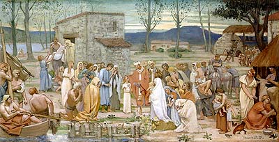
Oh, and here's a cool Puvis De Chavannes called The Childhood of Saint Genevieve (1874.) It's a 40" x 20" study for a mural and it sold for $937,000 in 1998:
The Warhol show was great - it's always a treat to see his large scale work in person, and the chance to see his early illustration work is rare. My only complaint was that it seemed to white-wash him a bit. There are plenty of examples of his "disaster" series (my favorites) dealing with violence and death, which add an edge to the popular conception of him as an artist dealing only with fluffy celebrity and consumerism. But there is hardly any mention of sex. This article from the New York Times says the same thing. My only other complaint was that there was no poster or postcard of my favorite piece, a large Joeseph Beuys in black, maroon, and diamond dust:
I like this image for several reasons: First, it looks very cool with the two dark tones, Rothko-esque, and it glitters from the diamond dust. Second, I like the juxtoposition of the two artists, Warhol and Beuys. On the surface they seem very different: Beuys the serious Germanic artist-as-shaman using earthy materials like wax, felt, and iron, and Warhol the fey artist-as-advertiser and fan always selling himself and re-inforcing the celebrity and brand culture. But when you examine their goals, you find that both were trying in their ways to bring art down from the ivory tower and give it back to the people. I think Warhol saw this and that's why he loved Beuys. Plus the omnipresent hat and fishing vest Beuys wore gave him a great "look"
posted by Greg 4:05 PM
So the paintings are coming along great, slowly but surely. Now is the time where I have to think about what kind of finish I want to achieve, or rather, what kind of style they will have. Of course they will have my style, with colors and tones built up with semi-transparent layers and the brush strokes which like handwriting reflect my individual way of painting. But what I'm thinking about is how much detail vs. stylization I will use. Realistic painting relies heavily on simplification of details. One can't paint every weave of yarn in a sweater, so instead you paint a color field and add a few highlights and shadows to suggest texture. The question then becomes how much detail you will try to represent and how much you will leave abstract. It's really the question of the ages for painters. In modern painting, pretty much every extreme has been tried, and the amount of detail you use makes up a big part of what is called your style. Here's an example of extremely simple realistic painting:
It's by Roy Lichtenstien. The contours of shape are delineated by big black outlines, and the local colors are represented by a solid color or a static pattern with no modeling. Though it is simplified, you can still tell who it is (if you knew her) and what's going on in the picture. Here's an example of extremely detailed painting:
This one is a closeup of a painting by Ingres. Though it is still simplified compared to what the human eye can perceive, it is very detailed. Each fold in her head wrap is represented, each pearl reflects a different view of a window, each braid is delineated. The colors and tones blend into each other in the face to represent a smooth surface, and each shadow grows darker in miniscule increments. But you can see that the image is simplified from reality by noticing that each hair is not represented individually. Painters through the ages have settled on different degrees of stylization in their representation, and the changing fashion goes a long way towards explaining the various phases or "isms" of art history. Early western artists, painters of icons, were very stylized:
There is very little modeling, and proportions are not realistic. The artist Giotto was the first to begin modeling and trying to express emotions, and he changed painting forever, leading to rapid advances throughout the renaissance:
It's still stylized, but much more realistic than before. Botticelli is another step, one of my favorites:
It shows modeling, but there is still a black outline and other simplifications. By Michelangelo's time, shadow, contour, and anatomy were much better understood, but he was pretty stylized too, especially with his distorted proportions used for great effect:
This process generally can be looked at as moving closer and closer towards realism, with some side-trips. In fact, many of the artists who are most famous today are those who's stylizations or abstractions were the most extreme for their time: Rembrandt, Velasquez, Franz Hals. Here's a close up of some eyes by Hals:
(If you're ever in Holland, it's worth a trip to Haarlem to see the tulips and Franz Hal's house/studio there, where most of his major commissions still hang. This late painting is so modern looking with it's simplifications and masterly brushwork that it will blow your mind.)
Viewed this way, representative painting reached it apex with David and Ingres in 19th century France. What's interesting about them is that at the same time we saw the birth of modernism with artists like Gros and Delacroix, who rejected precision and detail in favor of grand emotion brought about by the use of exaggerated color and suppression of detail. In fact, Delacroix's journals go on and on about how important it is to suppress detail, and he cites the overabundance of detail as the main reason why photography for him could not be fine art. With the triumph of Delacroix and the Romantics, artists started embracing stylization as a way to make their pictures more powerful. Manet shocked Paris with his simplifications, as much as his break from classical subject matter. From Manet came two movements: impressionism and symbolism. Impressionism sought to tear down the static image and replace it with the fleeting sensations of reflected light. By now we're all familiar with this style, but at the time it was shocking and hard to understand. Symbolism on the other hand was more concerned with emotional response than physiological. In the pursuit of heightened emotions, symbolists used heightened colors and distorted proportions in their representations. Munch is a good example of this:
Another symbolists who developed a clear style which was very popular in his day despite the fact that it was definitely not academic was Puvis De Chavannes:
Freed from academic rules, artists began to cultivate their own highly individualistic styles. This brings me to the two self-portraits of Van Gogh and Gauguin bellow. Contemporaries and friends, their styles were completely different: Van Gogh created agitated surfaces of thick impasto while Gauguin favored simplified color fields using very thin washes of paint. Both were great. After the turn of the century, modernism took over and the fracturing of the image started by the impressionists and pushed farther by the fauves and cubists continued into abstraction and eventually minimalism, until it pretty much reached the end of that road in the 60's with monochrome (one color) paintings. This ultimate breakdown of the image led to post modernism, which as an art movement can be understood as the re-combination of various approaches from the past in a way that reflects the individuality of the artist. One of my favorite postmodern painters is the LA artist Llyn Foulkes, who uses mixed media and different styles to create powerful images which are still anchored in art history:
The bottom line for artists nowadays is that there are many styles, or levels of abstraction to choose from. There is the hyper-simplifications of Andy Warhol or Alex Katz:
Or there is the pinpoint realism of Phillip Pearlstein:
The mixed David Hockney:
Or the dense Lucian Freud:
For me personally, the process of deciding how much to stylize has been very interesting and instuctive. I found that with the tracing of the projected images, the proportions were so correct that a likeness was there from the start. And if I just lay in a few local colors, it still looked great, like a Katz or Warhol. But I want more. I don't know how to paint: I only took a few life-drawing classes in school, instead concentrating on the more conceptual classes. The how-to stuff, beyond the basics of color mixing and paint properties, is not taught too much in most art schools these days. I suppose I could have pursued it more, but I was more interested in the chance to create my own style by coming up with my own solutions. It's like re-inventing the wheel in a way, but when it's done people say, "That's Greg's wheel for sure, no doubt." I have no regrets about this, but it does mean that when I come to paint a portrait, I'm not sure where to begin. Should I lay in the shadows in red first, or in blue, or brown? Or should I lay in a local flesh color, then add the shadows with glazes? There are a million ways to do it, and none of them "wrong."
At this point I think I have a pretty good idea of what I want the finished paintings to look like, but for the last two months that's been open to question. I've been experimenting with the different ways to paint flesh, or bushes, or cars, or hair, or clothes. I like a surface which looks smooth from a distance but breaks down into individual brush strokes and colors as the viewer gets closer. I like some blue and red in the shadows, or perhaps some purple, rather than gray. I like using thin layers of transparent flesh colors, made by mixing in a lot of gloss medium to build up a "skin" of paint which because of it's 3 dimensional properties looks different when viewed from different angles. But tomorrow I go see the Warhol exhibition and maybe everything will change:-)
posted by Greg 10:32 AM
In other blogs: Foji fleshes out my observation about the three different categories of other drivers, and how one person can be all three at different times. Laura castigates the WWF for crying enviro-wolf and squandering their credibility. Babalog talks about a night in the Valley. (Lest you get mad at me, know that the last time we played, she beat me soundly.) Marc Brown eulogizes the Gnutella guy, then blogs drunk.
posted by Greg 9:04 AM
If you're interested in the issue of file-sharing, intellectual property, and copyright stuff, don't miss this great article by Janis Ian.
posted by Greg 2:08 PM
The Purple Heart (1944) - Good Good Good - I love these movies made during the war as propoganda. It is very interesting to know what these movies want to make you think and then watch how they go about doing it. If you end up hating the enemy by the end, then the picture did it's job. This one was directed by the great Lewis Milestone, who also did the powerful anti-war movie All Quiet on the Western Front in 1930 and the awesome pro-America war movie A Walk in the Sun in 1945. It centers around a Japaneese show trial of 8 captured airmen who had bombed Tokyo in what latter bacame known as the Doolittle Raid. The men are offered the chance to live if they reveal the details of the mission, and we get to see what happened through flashbacks as each prisioner is taken away individually to be tortured. In the end, they must decide as a group between death and dishonour. It's very well made and draws you into it's drama and holds you till the bittersweet end, when the prisoners dream of what they'd be doing if they were back home.. Though 8 airmen from the Doolittle Raid were captured by the Japaneese and 3 executed, I could find no mention in the histories of a show trial and I think that everything beyond their capture was made up for the movie. Also note: The Doolittle Raid was a boon for American morale and was the subject of the book and movie called "Thirty Seconds over Tokyo (1944)," and it was also dramatized (for no good reason, though it was arguably the best part of the crap movie, with Alec Baldwin as Doolittle) at the end of Pearl Harbor.
posted by Greg 12:37 PM
Saturday, July 06, 2002
Mr. Deeds (2002) - Good Good Good - I thouroughly enjoyed this comedy with a heart. It was especially strong in the first half but then slowed down a bit in the second half, but overall I thought it was a lot of fun and very sweet. We saw it at the new Arclight at the Dome theaters in Hollywood. It's a very well appointed theater, but the $14 ticket price means I'll probably only go there for special occasions. They have assigned seating, which I didn't like too much, but the seats were super comfortable and had good sight lines.
posted by Greg 12:32 PM
Men In Black II (2002) - Good Good Good - My companion and I have been eagerly awaiting this sequel and decided to continue our unintended habit of seeing movies on their opening days. One phenomena I've noticed during these early screenings is the inevitable presence of that one guy, there alone, who laughs much louder than anyone else and is prone to reacting to scenes with loud outbursts of "oh!" or "jeez!!" We like to sit up close, and unfortunately so does he. At least once you notice this individual he becomes funny rather than annoying, and you can still enjoy the movie. And enjoy it I did: MIIB has everything you want: lots of crazy aliens (everywhere you look, if you look in the right places,) cool gadgets and weapons, fast chases, Tommy Lee Jones as a mail carrier, and a plot revolving around saving the world. Something about Jones and Smith together is just funny, and their chemistry is still the best part about the movie (also the talking dog.) On the downside, the plot lacks the coherance of the first one, but at a short 88 minutes, you're into the finale before you really notice. The other thing that takes it down a notch is that the song isn't as good as the first movie's. One other thing I really like about the MIB series is that is takes the conspiricy theory of a government cover-up of aliens and expands it to an absurd degree, having fun with the idea and at the same time making fun of those who really believe it.
posted by Greg 11:36 AM
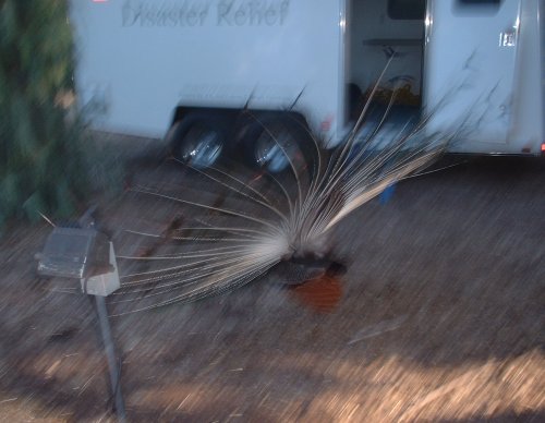
You know you have it good when, no matter how hard you try, you just can't wait until lunch to eat your leftover homemade California style salmon, corn and green onion pizza (pictured bellow.) So you sneak into the snackroom and nuke it for a few seconds, then skulk around the empty halls enjoying the deliscious flavor combo, wishing there was more, and savoring it slowly to prolong the taste sensations.
posted by Greg 11:06 AM


 I'm really excited and nervous in a good way. I've got a lot of work to do, but it's a small space so I won't be showing all the new pictures. This is good because I'll be able to concentrate in the next few weeks on just those pictures which will be in the show. Unfortunately it means that some of the paintings won't be in the show, but hey, I have to leave some to sell on ebay, right?
 We attended the very first showing at the Los Feliz 3 with an excited and receptive audience, ready to laugh. It's hard for me to be objective on this one because I've looked forward to it for so long, but I can say that I had a smile on my face throughout and even now feel a strong urge to see it again.
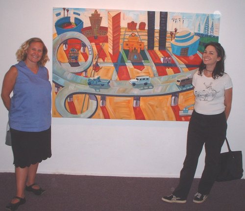

 Caught
 Well, watch this movie and learn. It's sunk by a script that makes no sense, even to an audience willing to suspend disbelief. The movie makers seem to have forgotten that there might be something funny about their concept, and the lack of any humor whatsoever eventually becomes grating.


 My only complaint was that it seemed to white-wash him a bit. There are plenty of examples of his "disaster" series (my favorites) dealing with violence and death, which add an edge to the popular conception of him as an artist dealing only with fluffy celebrity and consumerism. But there is hardly any mention of sex.


