"The man who has honesty, integrity, the love of inquiry, the desire to see beyond, is ready to appreciate good art. He needs no one to give him an art education; he is already qualified. He needs but to see pictures with his active mind, look into them for the things that belong to him, and he will find soon enough in himself an art connoisseur and an art lover of the first order."
"Dirty brushes and a sloppy palette have dictated the color-tone and key of many a painting. The painter abdicates and the palette becomes master."
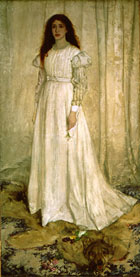
You can't talk about Sargent without mentioning James McNeil Whistler, another American ex-pat artist. He lived in London during the late 19th century and was famous not just for his paintings but for his flamboyant personality. We can't experience that, but we do have his art, which is enough to keep him in our minds for many years. He was among the first to argue for art for art's sake, an idea which started the trend towards modernism and abstraction. He was heavily influenced by Japanese prints and admired their colorful abstraction of image. He liked to equate his paintings with music, often titling them "prelude" or "sonata." The wordless language of music is what he tried to portray in his paintings, such as this one called "Nocturne in Black and Gold: The Falling Rocket":
When Ruskin denounced this painting and wrote that he was "flinging a pot of paint in the public's face," Whistler sued him for libel. Like today, the controversy ensured that everyone wanted to see this painting. He also wrote a book called "The Gentle Art of Making Enemies" about his philosophy of art and life.
And you can't mention Whistler without talking about Turner. Turner was a very English artist who excelled at painting the sea and sea related scenes. He approached abstration and art for art's sake in his attempts to re-create the swirling clouds of a storm or an angry sea. At the Tate Gallery in London there is the Turner Annex, where you can see hundreds of his paintings as well as his paint box and pallette. It's really quite overwhelming. He's also the namesake of the notorious Turner Prize, but that's not his fault.
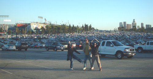
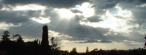
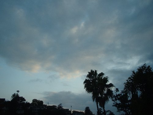
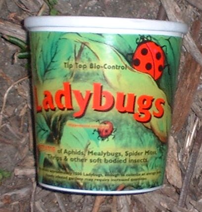
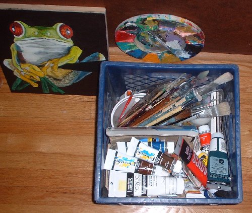
Did you see those pictures down there? The first one is a sunset pictures from yesterday. It's not very dramatic but I like the blues and grays in it, and of course the palm trees. The next one is a picture of the cup that the Ladybugs came in. We released them on Thursday evening in an attempt to control the aphids which are swarming on our artichoke plant. I'm told that the aphids and the ants form an axis of garden evil which only the introduction of 1500 ladybug ground troops can counter. A note: one ladybug is very cute, but a group of a thousand of them is really quite creepy. I'm glad they're on our side. The next picture is a shot of the milk crate in which I keep my paints and some brushes. The colors on top are the ones I'm using most, burnt umber, raw umber, prussian blue, white, red, pthalo green, etc.. Those are actually mostly old brushes that I don't really use much. Once a brush gets frayed it's hard to control it and you end up spending a bunch of time wiping out what you just painted, to the point where it's really worth it to get a new one (this is a hard lesson for a scrooge like me to put in practice.) You can also see a pallette and the 1x1' painting of a frog I'm doing. It's coming along nicely, but it's not done. The frog I mean.
posted by Greg 10:07 AM
Albert Pinkham Ryder is one of my favorite artists. Here's what The Detroit Institute of the Arts has to say about this painting in their collection, "The Tempest": Ryder was a reclusive, self-taught artist, whose painting style is both highly personal and very expressionistic. In The Tempest, Ryder combines two of his favorite themes--his love for the sea and his fascination with Shakespeare. The painting is not a literal scene from The Tempest, but a combination of all the major elements from Act 1, Scene 2, placed into one dramatic storm-filled landscape. Ryder reworked the painting for more than twenty years and at one point the artist took a hot poker to the canvas and dragged it through the thickest part of the sky. The Tempest remained in the artist's possession until his death.
I found this because I was looking for paintings by the American Robert Henri. Henri is one of those guys whose paintings always catch my eye at museums. He wasn't as famous as the similarly styled John Singer Sargent, and his realist style was out of date at the turn of the century, but he was a great paint handler and I like him. Here's an example:
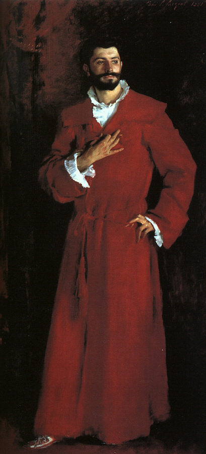
John Singer Sargent was a great painter and is more famous than Henri. He worked in Paris and dabbled in impressionism before returning to his Spanish influenced realist style. You can see a few of his works here in LA, including this one at the LACMA:
This site contains great articles on various art techniques.
posted by Greg 11:40 AM
Tuesday, April 23, 2002
I'm excited to announce that blogging is now a family affair!
posted by Greg 1:27 PM
Sunday, April 21, 2002
Paradoxes of painting - Here's an article about the paradoxes of painting which argues that it's a good time to be a painter. Filled with good insight, it's worth reading if you're interested painting's place in the modern world.
posted by Greg 3:28 PM
I know I said last week that I was done with the projector, but then I realized that I hadn't done any pictures related to music - and that's just not right! So this weekend I set it up again and traced out a few more pictures of people singing or playing, including one of the singing brakeman Jimmie Rodgers on the moon. Now I'm really done, and the projector is being returned tonight. Here's some of the CD's I listened to: Deep Purple - In Rock Bob Dylan - Love and Theft Camper Van Beethoven - Our Beloved Revolutionary Sweetheart Lefty Frizell - Greatest Hits Leadbelly - Midnight Special Black Flag - Damaged/No Values Rainbow - Rising The Byrds - Sweetheart of the Rodeo
posted by Greg 3:24 PM
When I was listing the CD's I listened to while tracing last weekend, I knew I'd forgotten some. Today I realized that one of the ones I forgot was "Village Green Preservations Society" by The Kinks. I've been walking around all morning singing "Big Sky" from that album, an amazing song which personifies the sky as something humans look to for sympathy, but who's "too big" to care about their petty problems. Somehow he feels bad about it though. Here's some lyrics:
Big Sky looked down on all the people who think they got problems They get depressed and they hold their head in their hands and cry. People lift up their hands and they look up to the Big Sky But Big Sky is too big to sympathize
Big Sky's too occupied Though he would like to try And he feels bad inside Big Sky's too big to cry
The album is sort of a concept album, with most of the songs revolving around themes of nostalgia. Nostalgia doesn't sound like the most rocking sentiment, but The Kinks make it so. This would have to be on my list of "perfect" records, records on which every song is great and which I never get tired of listening to. And if you do an internet search on it, you'll see that I'm not alone in feeling that way.
posted by Greg 9:10 AM
Wednesday, April 17, 2002
Two Delacroix quotes I read over lunch:
12 October, 1856: "To be satisfied with oneself is the greatest enjoyment of all and in a sense that is not so indirect as it might appear, one likes to be satisfied with other people's opinions about oneself. Some people derive this feeling from a sense of virtue, but other from external advantages that make people envious."
Delacroix makes it clear in other entries that he's after the satisfaction which comes from virtue. He also makes it clear that self-satisfaction is an ideal goal people strive towards and approach, rather than something they get and keep. Delacroix was admired by some in his day, but not universally. His paint handling and color were ahead of their time and he was the butt of much criticism. Luckily he saw beyond it and stayed true to his vision, while also being able to admit that even though it wasn't important, he did care what others thought of him. He has little appreciation for "external advantages" which often accompany deep pockets but dull minds. Instead he shows more interest in the poor but intellectually stimulating writer or the master craftsman who spends his life engrossed in his work and has no time for the so-called better things in life. Delacroix didn't spurn luxury, but neither did he put much stock in it. The work was the most important thing to him.
21 October, 1856: "Marvellous weather. I still have an inexhaustible appetite for and a faculty for receiving impressions such as one usually possesses only when one is young. I think that most men do not understand these feelings. The say: 'It is a fine day!' 'What big trees!' but it gives them no particular pleasure, no exquisite sensation of living in a poem."
The "exquisite sensation of living in a poem." That's just plain beautiful. Delacroix also has several entries about how the memory of an experience will bring more pleasure than the experience itself. He talks about the tendency of one's memory to edit out the bad parts and exaggerate the good feelings. For the artist, a painting is like a frozen memory - an impression of feelings fixed in one state through time. Often times I can look at paintings from years ago and remember exactly where I was when I did them and usually what events triggered the feelings which are expressed in them. For the viewer, a painting changes over time because it is always viewed through the prism of how the viewer is feeling at the moment he sees it. In that way it is always changing even though physically it is always the same. Do you ever have the experience where you put up a picture you like in your house and then forget about it, let it blend in with the general impression of your daily surroundings, only to suddenly notice it again in a profound way months or years later? I love it when that happens.
posted by Greg 1:46 PM
Among the Bourgeoisophobes - Here's a long but very interesting article about the anti-bourgious, kind of like what I was talking about a few posts down. Very interesting!
posted by Greg 3:49 PM
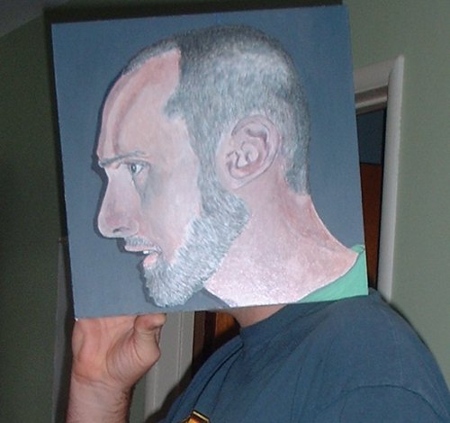
Sunday, April 14, 2002
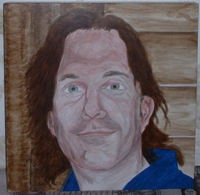
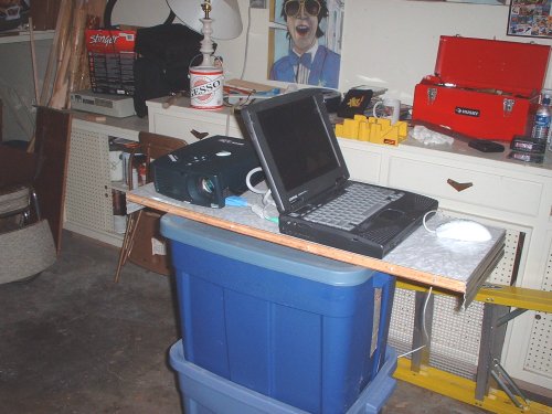
Above is a picture of my projection setup in the garage. In the foreground you see my laptop and the projector set up on a leave from the dining room table, which is balanced on three of those blue rubber tubs. This is relatively stable and yet easy to drag around. In the background you can see a gallon of gesso, the chalky white priming paint, and my pastel of Dan. Under that is our Bad Batz Maru CD player and a stack of CD's, a coffee cup, my mitre box and saw for cutting 45 degree angles on the supports, and my tool box. Above that you can just catch a glimpse of my 100 years of Popular Mechanics poster.
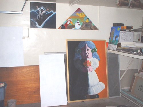
This is a picture of the wall I project onto, with two blank panels ready to go. To the right of that are three old paintings representing three different eras: The triangle is one of the first paintings I made in beginning painting class at UCSB. I copied the bird and snowman out of a children's book on color, and added a shadowy figure for that Dali effect. Under that is a large oil painting on a chalk board of my piggy bank Virginia from my graduation show at UCSB. Above that to the left is an acrylic painting of Jesus calming the Sea of Galilee that I did when I was in graduate school at Otis. You can also see a very early painting of some repute called "The Freedom Bean."
posted by Greg 5:31 PM
Another weekend spent tracing projections. This will be my last for awhile, as I have to give the projector back to it's rightful owner. That's a good thing because I now have many many hours of work ahead of me painting in what I've already traced. In order to make this a properly rounded series of paintings, I traced out some pictures in other genres besides portriats: a still life featuring my piggy bank, a landscape featuring the sun setting through clouds from a picture taken from my front room, an animal picture of a frog, and a copy after Delacroix of his picture "Lion Pouncing on a Hare." I figured that Delacroix has been such an inspiration that I should do an homage and learn from him by copying. I also traced out a few more portraits, a group portrait, another flower painting, and the biggest painting in the series, the finale, a portrait of my parents. So now I have my work traced out for me. I intentionally pushed the limits as far as the amount of detail to include in some of these pictures in order to challenge myself to come up with a way to represent them in paint. The flower picture in particular features a big flower with a bee in it, and a background with other flowers, a lawn and canopy, some architecture and the sky. That's a lot for 24x16". One note about the portraits: There are many people I would have liked to have painted but just didn't have the right pictures of. I don't want anyone to feel bad if I didn't do a painting of them. If this goes well, I'll get to everyone eventually. These paintings were conceived as examples of what I can do which I can use to get commissions or shows in the future. As such I tried to get as many different types as I could: smiles, profiles, larger than life, life-size, group shots, full length, busts, etc.. Each picture is something a little bit different. Next time I start a series I plan to work with people and take their photos with a painting in mind rather than work from photos I already have. But that's a ways off, and now I must keep my mind on the work at hand. CD's I listened to while I worked: Bob Dylan - Love and Theft Deep Purple - Fireball Townes Van Zandt - collection from internet Jimmie Rogers - Greatest Hits Hank Thompson - Greatest Hits 1969-1974 Husker Du - Flip Your Wig Elvis - King Creole soundtrack Gene Vincent - Greatest Hits Elvis - Loving You soundtrack Greg's custom metal mix Bob Dylan - Love and Theft again
posted by Greg 2:56 PM
Saturday, April 13, 2002
We went to the opera last night to see Mozart's "The Magic Flute." It was really good, full of Enlightenment values and special effects.
posted by Greg 11:25 AM
Joseph Beuys: "Creativity isn't the monopoly of artists. This is the crucial fact I've come to realise, and this broader concept of creativity is my concept of art. When I say everybody is an artist, I mean everybody can determine the content of life in his particular sphere, whether in painting, music, engineering, caring for the sick, the economy or whatever. All around us the fundamentals of life are crying out to be shaped or created."
posted by Greg 12:18 PM
Tuesday, April 09, 2002
The Subterranean Fortress - Just saw this on the History Channel's "Secret Passageways - The Cold War." It's a 4 story deep bomb shelter, with all the trimmings. What seemed remarkable to me is that the wife said her husband spent 5 hours a day doing construction on it after work at his engineering job, and that he did it more for the joy of building than out of paranoia.
posted by Greg 12:47 PM
Monday, April 08, 2002
Delacroix:
"I'm sorry for people who work calmly and coldly. I think that all they do must inevitably be cold and calm and must plunge the beholder into an even worse state of coldness and calmness. Some people congratulate themselves on this calm composure and absence of emotion: they call it mastering their inspiration... A great painter concentrates the interest by suppressing details that are useless, offensive, or foolish. His mighty hand orders and proscribes, adding or taking away from the objects in his pictures, and treating them as his own creatures; he ranges freely throughout his kingdom and gives you a feast of his own choosing...."
I've started a new series of paintings and have decided to keep a record of my progress here on my blog. Inspired by Delacroix's journal, I'll use this space to talk about ideas, influences, and techniques I'm exploring, as well as a way to keep a record of my progress. I have a lot of work to do and a lot to learn, and with these posts I hope to create a document which reflects my engagement and shows some sort of evolution in my thought. Another benefit is that having a public record of how they're coming along will keep me motivated. While I've rarely lacked motivation, there's no such thing as too much of it. When I was in art school with a public studio and weekly classes, there was always the goal of the next critique to "inspire" me to create something new, or to finish what I was working on. That sense of community was one of the best things about art school, and I hope to re-create it in part here. Yet another reason to do this is to provide inspiration for others. I'm a big proponent of the "lead by example" idea, and I always appreciate "making-of" documentaries or articles. Creating art in general is something that makes me happy and gives me a sense of meaning for my life, and I want to share that feeling with others, to inspire them to create. Joseph Beuys was an influential artist and teacher in post-war Germany who taught that everyone is an artist, even if they don't know it. He said that by realizing and accepting that every creative act, from cooking to building a dog house, is artistic, one can better appreciate life and gain a sense of fulfillment. There's also a book called "Flow" by psychologist Mihaly Csikszentmihalyi which uses science to show that creativity and discovery, broadly defined, is the only path to human happiness. Now, I don't want to sound too full of myself. These are goals I'm working towards. I've got my work cut out for me, and I'm a bit scared that my execution won't live up to my conception. But alas, I'll follow the example of all the artists I love the most and keep working through all the fatigue and self-doubt. I'll carry on and do my best trying to make paintings which please myself, for once I'm satisfied then the appreciation of others is icing on the cake.
In my new project I use a computer projector to trace photos onto the panel or paper with a pencil, which I then paint. This is a technique I've used a little in the past, but have never explored in depth. For some reason I felt that this might be cheating, and that ideas which came only from my head were more pure. Now I see it simply as a tool to better express the ideas I want to explore. Drawing has never been my strong suit, and the projector helps with that. (Actually, it's the best drawing teacher I've ever had.) Drawing can be learned if you have 6 years to work at it every day, but that's just not realistic in the modern world. Plus there's David Hockney's theory that artists have been using projections for hundreds of years. Ayn Rand said that "Art is the objectification of ideas." I've done many paintings using the "automatic" method developed by the Surrealists, which means you start with no pre-conceived ideas and just let the painting happen in front of you. Ultimately this is a form of psychological self portrait, where you create a document of your pre-occupations and emotional state during the time you painted it. This is a totally valid practice and a lot of fun, and I will always go back to this kind of painting. But to make great art I think you also have to look outside yourself. The psychological aspects are always there, but the work is more open and outward looking, and hopefully can engage the viewer more consistently on a deeper level. The idea is to present specific themes and feelings while retaining the wonder that is painting: the interaction of color and form in a two dimensional space. I was inspired to pursue the idea of using a projector by two things: the tragedy of 9/11 and impending fatherhood. 9/11 underscored for me, like a lot of people, the truth that life is short and tenuous, and it made me think of the things I've always wanted to do but have put off. It also made me further realize how lucky I am to be living in Los Angeles surrounded by friends and family. In order to not take that for granted, I want to give something back to the world: my art. Impending fatherhood, besides the feeling of creative potency it inspires, represents the last brick in the wall of my adolescence, which I now stand upon as a full adult. It made me want to put my ideas into practice in order to fully engage with life. It is ironic that taking on this responsibility, with all the concentration and hard work it entails, makes me feel better than taking the lazy "why bother" route. For a while I was trying to give myself a break, to not push the art but let it come at my leisure, thinking this would make me happier. But really it just made me feel guilty for not fulfilling what I saw as my potential. Delacroix talks a lot about this in his journal, about how he can enjoy the mundane things one has to do, such as riding on the omnibus, much more if he's been working and is engaged in a specific project. He says that just the memory of working can get him through those times and conquer boredom.
A note about writing about art: Art, like music, is by definition beyond words. Art further stands out because unlike music or literature it can generally be taken in all at once, with no element of time. Painting is more specific than sculpture in that you can see the whole painting at once, while you have to walk around a sculpture and can never see it all. The emotions and thoughts stirred up by the interaction of form and color are what I call the wonder of painting. That said, I think it can't hurt art to write or talk about it. No matter how much I say about my ideas, each viewer will have their own experience with the work. They bring their own ideas and prejudices into it, and what I say should just be a jumping off point for their thoughts. You may choose to reject what I say, claiming that I'm fooling myself about what a certain painting means, and that's totally valid. On the other hand, what I say might help you relate what you see to other ideas that are important to you, and thereby act as the first statement in a conversation. I encourage you to email me at greg (at) mcilvanity.com if you have any questions, comments, objections, or if you want me to clarify any of the ideas I present here.
I'm finding that the tracing is a very small part of the execution, and that it leaves plenty of room for personal expression. First of all, I have to choose the picture and how it's composed on the panel. Most of the new works are portraits, mostly of friends but some of cultural figures. And in most of them the subjects are smiling or have some other specific facial expression. This is one of the benefits of working from a photograph. Traditional portraits show the sitter with a blank face, due to the fact that they had to sit there for hours while the artist worked. That was fine in the days before photography, when these portraits served as a document of what people looked like. Now a portrait photo can do this with more exact detail than any painter. But what a painter can do is use color, pattern, and abstraction to invest the portrait with a sublime quality that a photo doesn't have. By abstraction I refer to the necessary simplification that the painter must use when representing objects, because no painting will ever be as detailed as real life. The rise of modern art is directly tied to the rise of the middle class. As people were freed from lives of physical labour, they needed another source of meaning for their lives and they had the free time for the pursuit of beauty. Some look at this bourgoise tendency in art as a bad thing, but I see it as a wonderful manifestation of Man's use of reason and science to tame the wild natural world. My art is proudly bourgois and by showing subjects smiling or otherwise engaged in extreme emotional states I hope to bring beauty and joy into people's lives. The two criteria I have for choosing photographs are one: that they are of people I love and respect, and two: that I have a good picture of them. The first part is easy because like I said I'm lucky enough to be surrounded by talented, thoughtful, loving, and intelligent people. The second part is more difficult because as we all know, getting that photo of just the right moment isn't always the easiest thing to do. Most of the photos I've used I took myself with my digi-cam. It's getting harder because now that people know their picture might turn into a big painting they're a little more shy when they see me with it. Except for Coulter;-) For the rest of you just know that I'm only painting like 1 of 100 of the pictures I take, so don't worry about it.
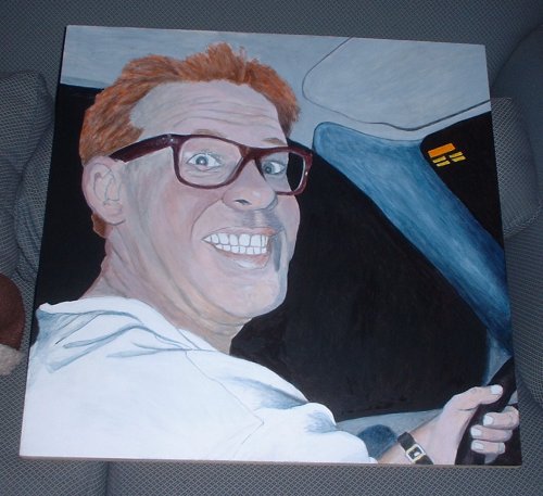
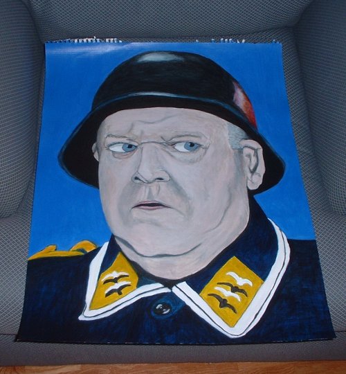
Most of the paintings are on hardboard mounted with glue on to wood stretchers, either 2x2" or 1x2" bars. The hardboard is the blond colored kind which is nice and stiff and smooth. The size of the hardboard varies from 1x1' to 3x4', and is cut on the big saw at Home Depot where I buy it. I prime it with 3-5 coats of gesso, a chalky white paint made for this purpose, and then sand it down a little to create a surface that's pretty smooth but not totally smooth. I'm using acrylic paint for this series. Oil paint is nice but you need turpentine to thin it, which means it's stinky and you need a well-ventilated space, plus it takes a long time to dry, up to a couple of weeks. I've used acrylic quite a bit more and so am more adept at handling it. It dries in a matter of minutes, which is good because I use a lot of transparent layers to build up colors and textures which would be unfeasable with oil paint. I use glossy gel medium to mix with the paint which adds body to transparent colors and creates the shiny surface often associated with oil paintings. Mixing colors is one of the things you can learn and get better at, but it's still a challenge. All colors mix with each other differently, and finding the correct ratio for the color you need, and mixing enough of it for the job, is a difficult skill that you don't hear about much. For instance, a tiny amount of red mixed with white gives you a strong pink, but the same amount of red mixed with blue hardly changes the blue towards purple. My main colors are: burnt umber - a dark brown raw umber - a light brown Prussian blue - a dark "navy" blue pthalo blue - the color of a Dodgers hat, or blue jeans cobalt blue - the color of the paint on the rails at Dodger stadium pthalo green - a bright green cadmium red - straight red cadmium yellow - straight yellow cadmium orange - straight orange white - lots of white others - siennas, dark green, dark violet, etc... I am not using any black in these paintings, instead choosing to mix my blacks. This is an old impressionists practice based on the theory that there is no such thing as a true black. I don't really agree with that theory, but I do think that a mixed black tends tends to add more life to a painting by setting off the colors near it. To mix black I usually use equal parts burnt umber and Prussian blue, with a little bit of red. Burnt umber and Prussian blue on their own tend towards green, so the red balances it out while keeping it dark. If I want a blue black I'll use a little purple as well and a little extra Prussian blue. My practice is to work from dark to light, starting with the shadows and working towards the highlights, and bringing out the details in the end. Most shadows in nature tend towards blue, so I usually start with a blue tint for the shadows and a bluish mixed black for the deep shadows. Flesh colors depend on the lighting and can vary from very pink to light brown or white mixed with yellow and orange. Sometimes the flesh shadows go towards red in homage to Rubens. Next I'll lay in the local color in a couple semi-transparent layers, so that the already tinted shadows stay darker. (Local color refers to the color something is, such as a red coffee cup. Even though the cup is red, depending on where the light is coming from different parts of it can look almost black, or pink and white in the highlights.) After that I'll add more shadow or highlights as needed, as well as outline where appropriate. Here's a list of the subjects I've started so far by size: 1'x1': Max profile 1'x2': Cranach's Venus 1.5'x1.5': Pink flower 2'x2': Self-portrait Self-portrait sticking out tongue Tony Joe driving Matt and Ken Molli Kelli and Jay Don and Jen 2'x3': Bonnie and Jeanine in masks with Forrest Ackerman's car 2'x4': Farmer in the Sky starring Coulter 24"x16": Sgt. Schultz from Hogan's Heroes Ayn Rand in charcoal Dan Kern in pastel
So that's this series of paintings. In the future I'd like to use the picture and projector technique to do other things, such as staged portraits, themed still lives, and dramatic mythological, historical, or narrative pictures using actors and costumes. But that's for the future.
Thus ends my introduction, and now for my first entry:
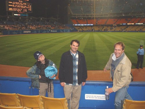
I spent about 13 hours this weekend in the garage tracing images: I did a bust of Aristotle on paper, a close up of a tomato on paper, Molli and Kelli in front of Paris Las Vegas on canvas, John and Kelli at the dodger game, a self portrait of me shooting a ping-pong ball rifle at the viewer, a four-person portrait I'm keeping secret, another secret portrait of a couple dancing, and a small copy of Bocklin's "Isle of the Dead." I want to get a lot of them traced out in case Jay takes needs his projector back. One of the challenges with this type of painting is deciding on what details to include and what to obscure. Like I said before, all representational painting relies on abstraction, and deciding how to represent things like foliage or crowds in the distance is hard, and will be a matter of experimentation. This is especially true of the crowd in back of John and Kelli at the Dodger game, deep in shadow but still recognizable as a crowd with some empty seats. It also occurred to me that the proportions of an individual's face are like a fingerprint and are the key to how we recognize people. This is borne out by the fact that you can get a likeness of someone from just a few lines indicating the brow, nose, shape of the mouth, and hairline. Designers know this, and most of Warhol's portraits rely on this phenomena. If you add their body shape to this equation, it explains how you can recognize people you know from far away before you can see the details. Ears are also unique to each individual, and thus I must get the major lines of those correctly too. This is where the projector really comes in handy. If I have the major aspects positioned correctly, I could paint the person as being green and you'd still know who it was. Here's a list of most of the CD's I listened to as I worked: Deep Purple - Fireball Bob Dylan - Love and Theft Townes Van Zandt - First Album Buck Owens - Live at Carnegie Hall Elvis - King Creole soundtrack Earnest Tubb - Greatest Hits Hank Williams - The Complete singles volume 3 Husker Du - Flip Your Wig Ray Charles - Greatest Hits Neil Young - Unreleased stuff from the internet Louvin Brothers - Greatest Hits


 You can't talk about Sargent without mentioning
 And you can't mention Whistler without talking about
 Albert Pinkham Ryder is one of my favorite artists. Here's what


 I know I said last week that I was done with the projector, but then I realized that I hadn't done any pictures related to music - and that's just not right! So this weekend I set it up again and traced out a few more pictures of people singing or playing, including one of the singing brakeman